
Click on any of the following topic headers to expand or collapse the section.
EpiCenter is designed to be a flexible tool for viewing California data on injuries that result in death, hospitalization, or a visit to the emergency department (ED).
Follow these three steps below to start exploring the data.
1. Select
Select the injury outcome from the blue panel at the top of the page. Outcomes include deaths, non-fatal hospitalizations, and non-fatal ED visits.
Non-fatal hospitalizations tend to be for more severe injuries that require greater medical treatment compared to ED visits.

2. Filter
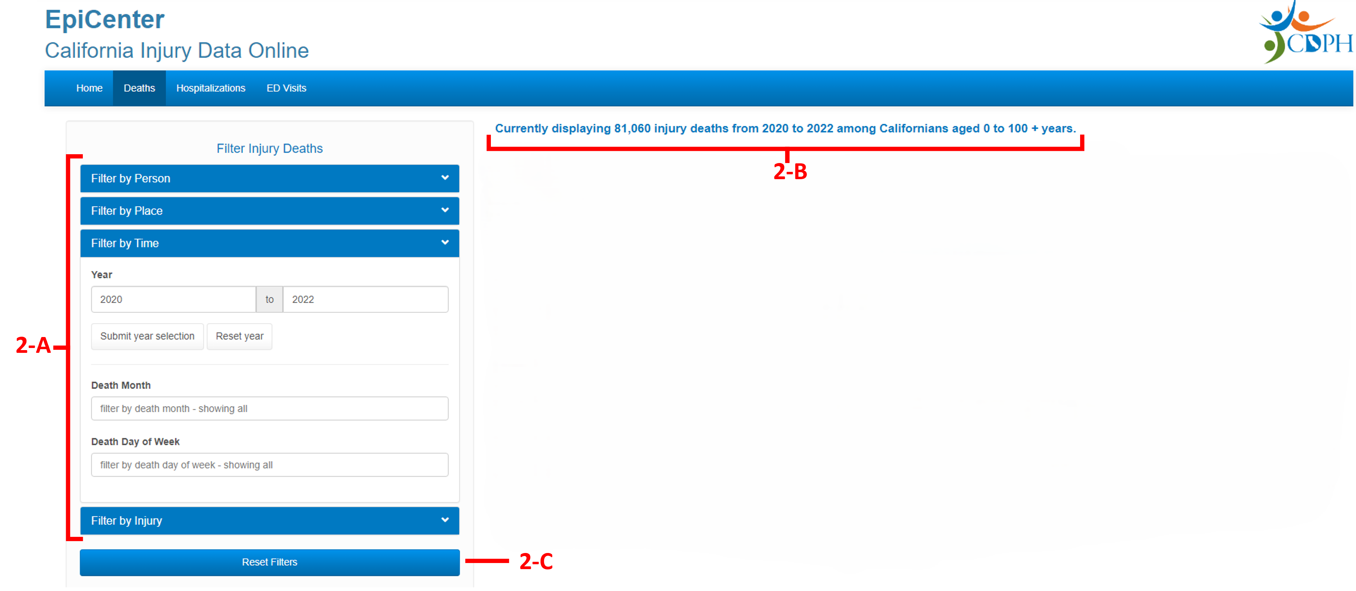
Use the sidebar on the left to view and select available filters.
- Filter: Filter the injury data using the drop-down menu on the left of the page (2-A). Filters are organized under the categories of person, place, time, injury, and treatment (for non-fatal injuries only). Click on a category to view/hide the filters it contains. Filters will be immediately applied.
- Filter Description: A description of the current filters and the number of injuries displayed appears near the top of the page, under the blue panel (2-B).
- Clear filters: To clear all filters, click on the “Reset Filters” button at the bottom of the filter panel on the left of the page (2-C).
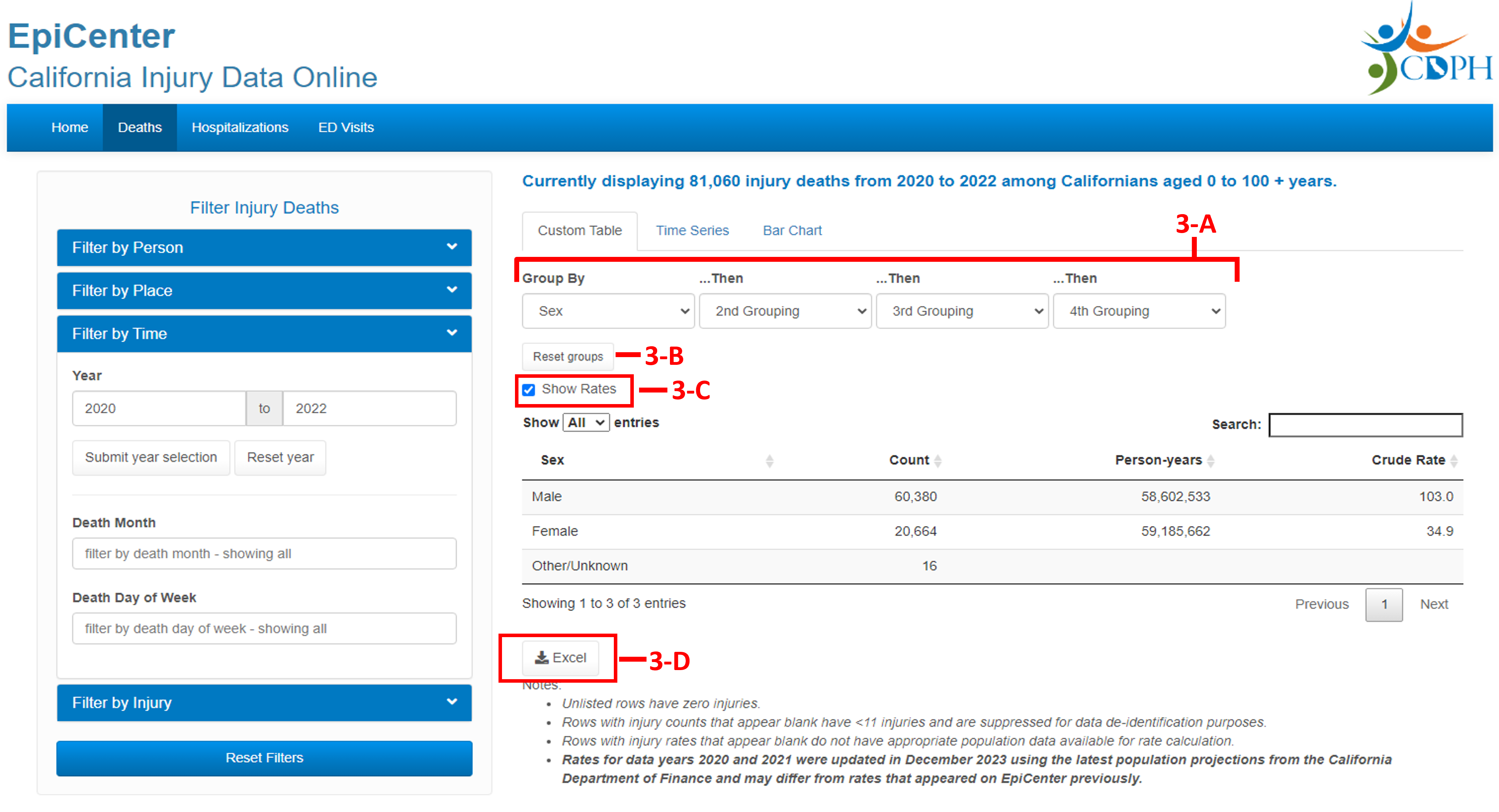
Display the data using the three outputs listed as tabs under the description of the filtered data (Custom Table, Time Series, and Bar Chart).
Custom Table: Displays injury counts by selected variables.- Grouping: The data can be grouped by up to four variables using the drop-down menus above the table (3-A).
- Reset groups: Click the "Reset groups" button to reset all grouping drop-down menus (3-B).
- Show Rates: The table will display injury counts for each grouping level. Check the “show rates” box to also display incidence rates per 100,000 person-years (3-C).
- Download Data: To download the table as an Excel file, click on the “Excel” download button below the table (3-D).
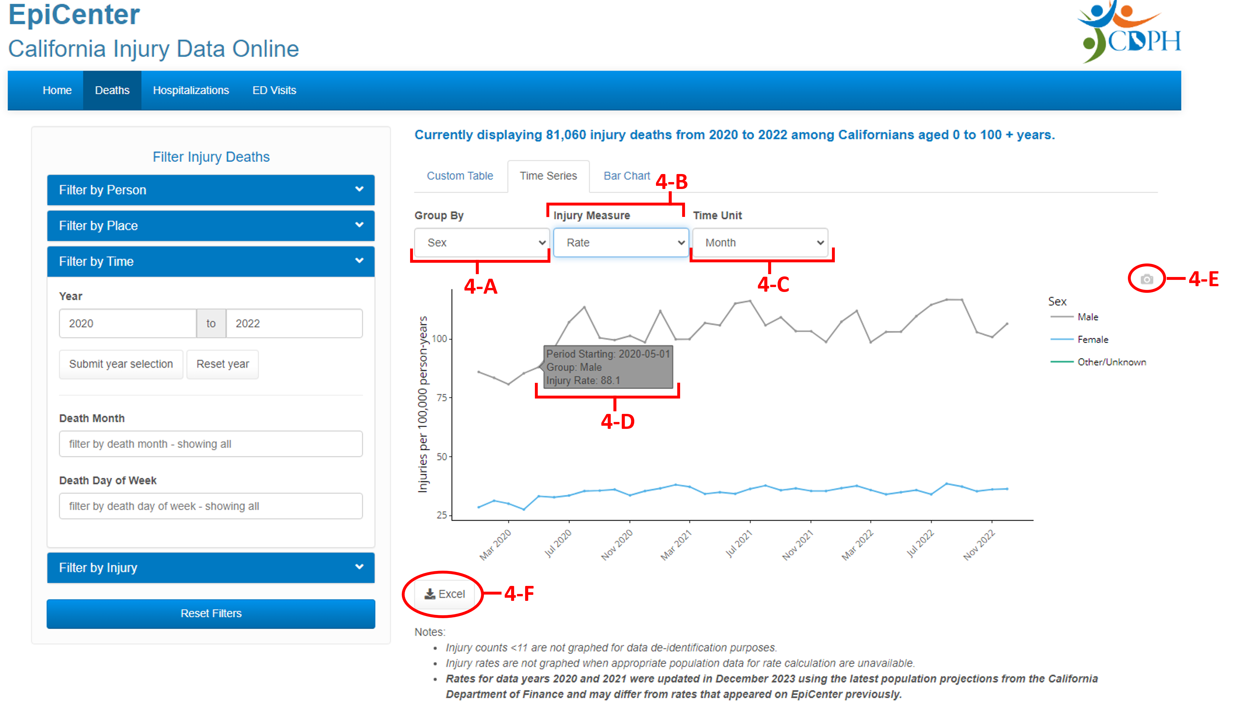
Time Series: Displays injuries over time as a line graph.
- Group by: Group the data by variables from the drop-down menu above the graph (please note the graph is limited to displaying 10 or fewer groups) (4-A).
- Injury Measure: Choose to display injury counts or incidence rates from the next drop-down menu (4-B).
- Time Unit: Change the time unit from years to months or weeks using the third drop-down menu (4-C).
- View Details: Hover over the graph to see values for each data point (4-D).
- Download Image: To download the graph as an image (.png file), hover over the table and a camera icon will appear in the top right corner – click on it (4-E).
- Download Data: To download the graph’s source data as a table (Excel file), click on the “Excel” download button below the graph (4-F).
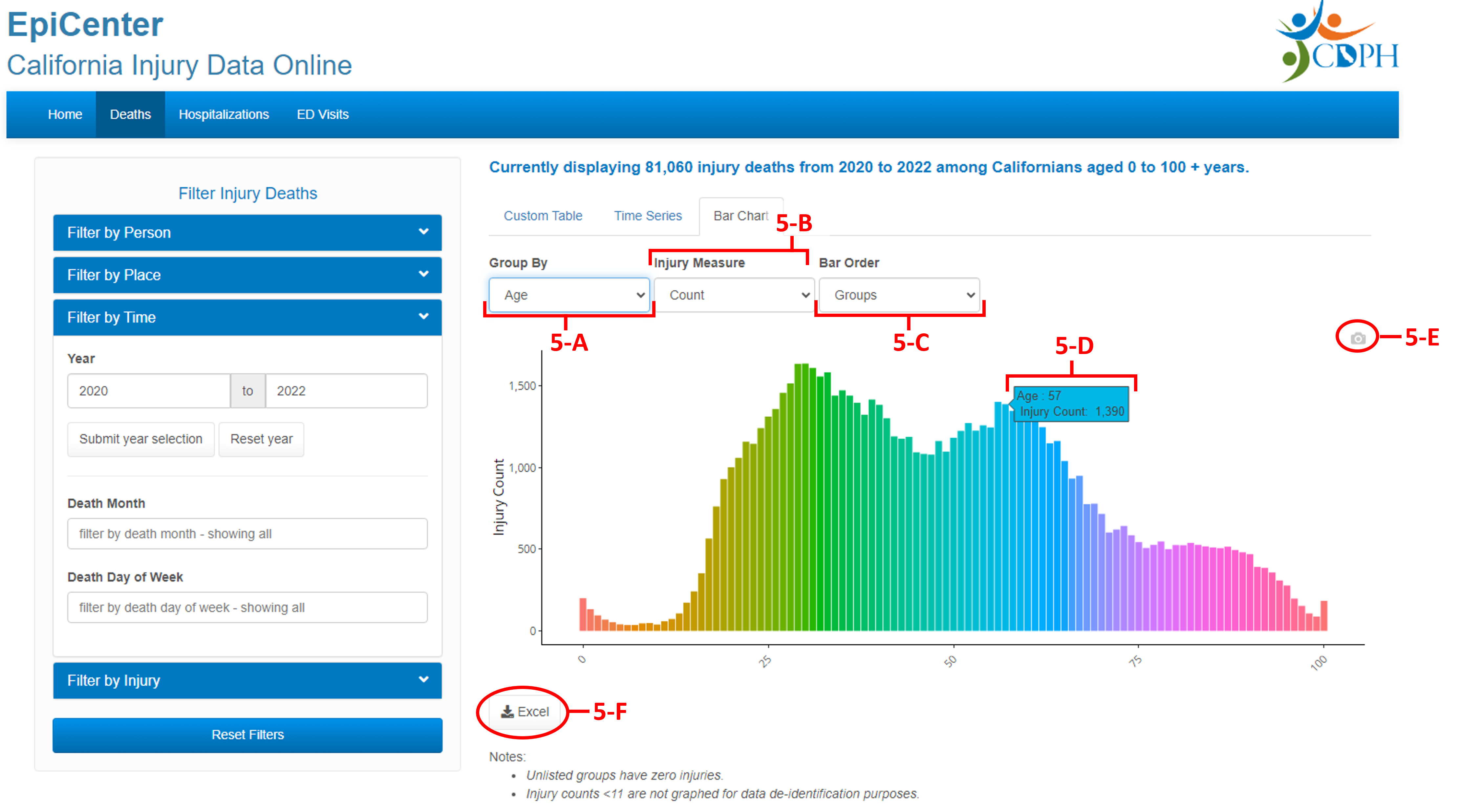
Bar Chart: Displays injuries by groups as a bar chart.
- Group by: Group the data by variables from the drop-down menu above the chart (please note the chart is limited to displaying 120 or fewer groups) (5-A).
- Injury Measure: Choose to display injury counts or incidence rates from the next drop-down menu (5-B).
- Time Unit: Change the bar order from the grouping variable (groups) order to the bar height (injury measure) order using the third drop-down menu (5-C).
- View Details: Hover over the chart to see values for each bar (5-D).
- Download Image: To download the chart as an image (.png file), hover over the table and a camera icon will appear in the top right corner – click on it (5-E).
- Download Data: To download the chart’s source data as a table (Excel file), click on the “Excel” download button below the graph (5-F).
EpiCenter is designed to be flexible and support a wide a variety of injury data analyses. Here are three suggestions to get started.
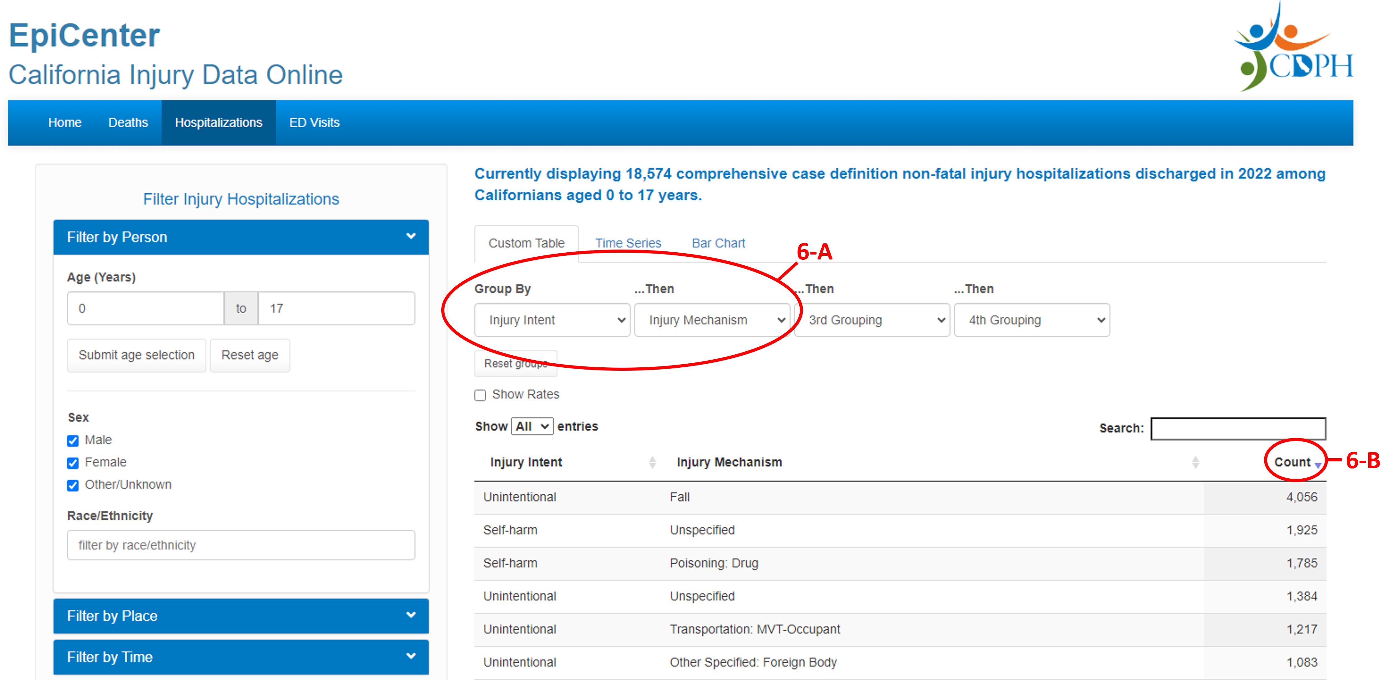
1. Leading Causes of injuryThose working to improve the health of a specific population may benefit from knowing the causes of injury that contribute to the most morbidity or mortality among that specific population. The Custom Table display can provide that information. First, select the injury outcome of interest and filter the data to the population of interest. The example below looks at injury hospitalizations among children under the age of 18 for the year 2020 (6).
- Select the injury outcome of interest and filter the data to the population of interest. The example below looks at injury hospitalizations among children under the age of 18 for the year 2020.
- In the custom table display, choose to group the data by injury intent then by injury mechanism (6-A).
- Next, sort the table by injury counts in descending order (6-B).
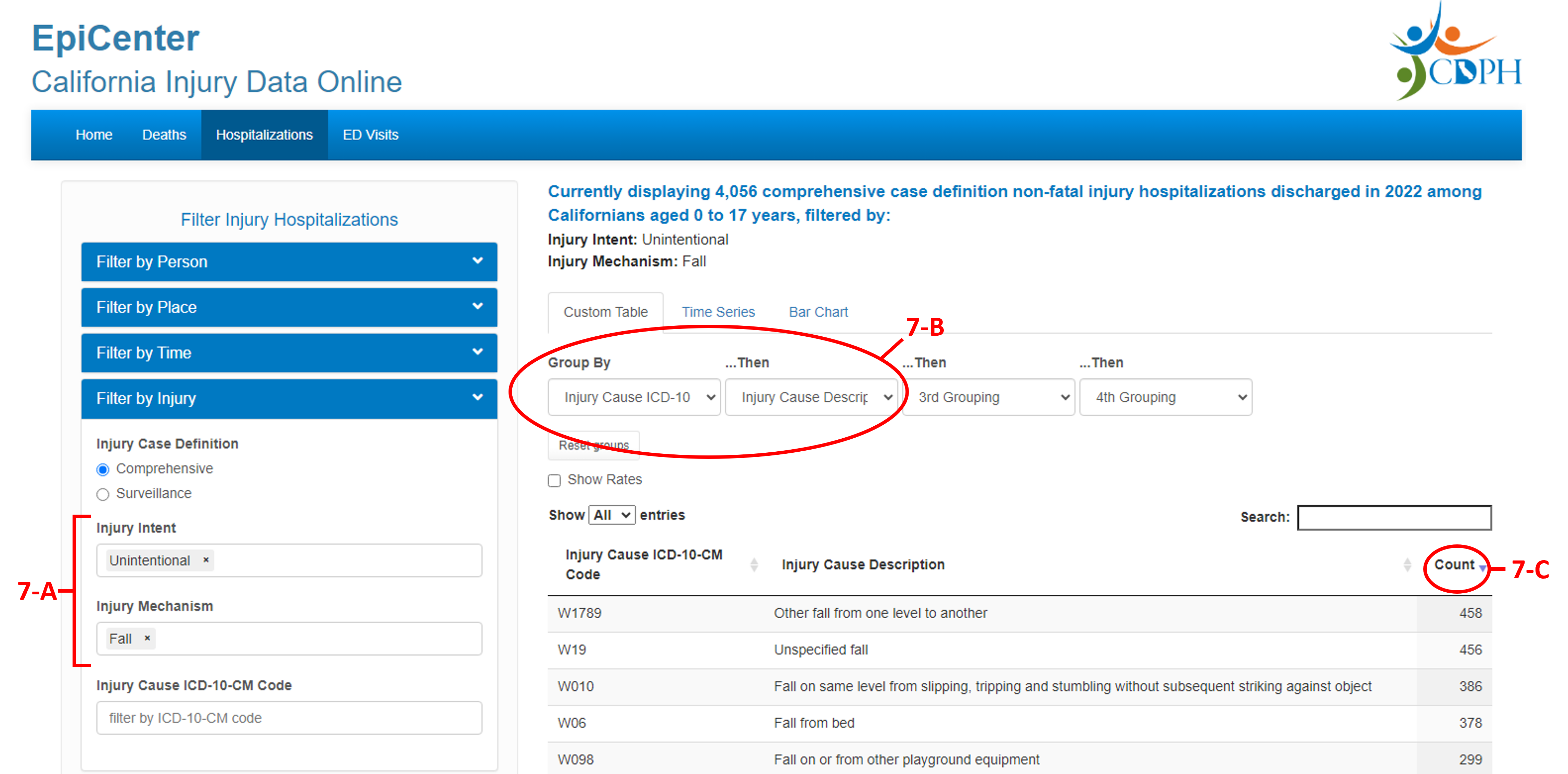
Intent by mechanism: Each intent-by-mechanism cause group consists of ICD-10 or ICD-10-CM codes that correspond to specific injuries. The example below builds on the leading cause of injury query above and looks at specific ICD-10-CM injury cause codes and descriptions for unintentional falls among children under the age of 18 for the year 2022.
- To identify the specific codes/injuries within an intent-by-mechanism cause group, further filter the data by the injury intent (e.g., Unintentional) and mechanism (e.g., Falls) (7-A).
- Then, group the table by Injury Cause ICD-10-CM Code and Injury Cause Description (7-B).
- Sort the table by injury counts in descending order to see which specific codes/injuries contribute most to a given intent-by-mechanism cause group (7-C).
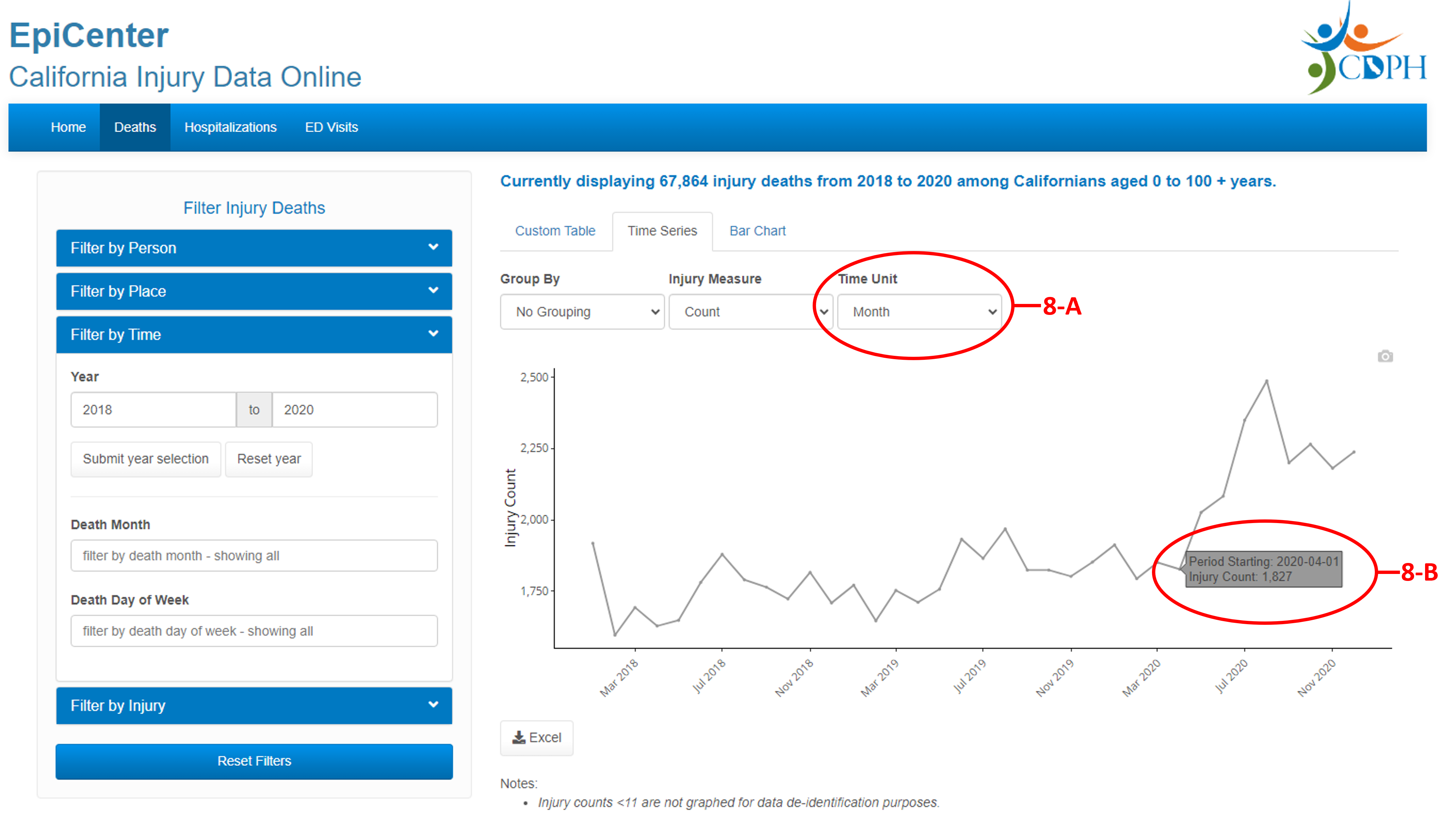
2. Injuries during the COVID-19 pandemic in 2020
The COVID-19 Pandemic contributed to drastic changes in health outcomes beyond Coronavirus deaths and illness. The Time Series display can provide that information. First, select the injury outcome of interest and filter the data to the population of interest.
- Select the injury outcome of interest and filter the data to the population of interest (but be sure to include 2020 data). The example below looks at injury deaths among all Californians.
- In the time series display, choose month as the time unit (8-A).
- The graph will show counts of injuries by month. Hover over the graph’s data points to see exact time periods and injury counts. You may notice considerable changes to injuries during the late winter and early spring of 2020 (8-B).
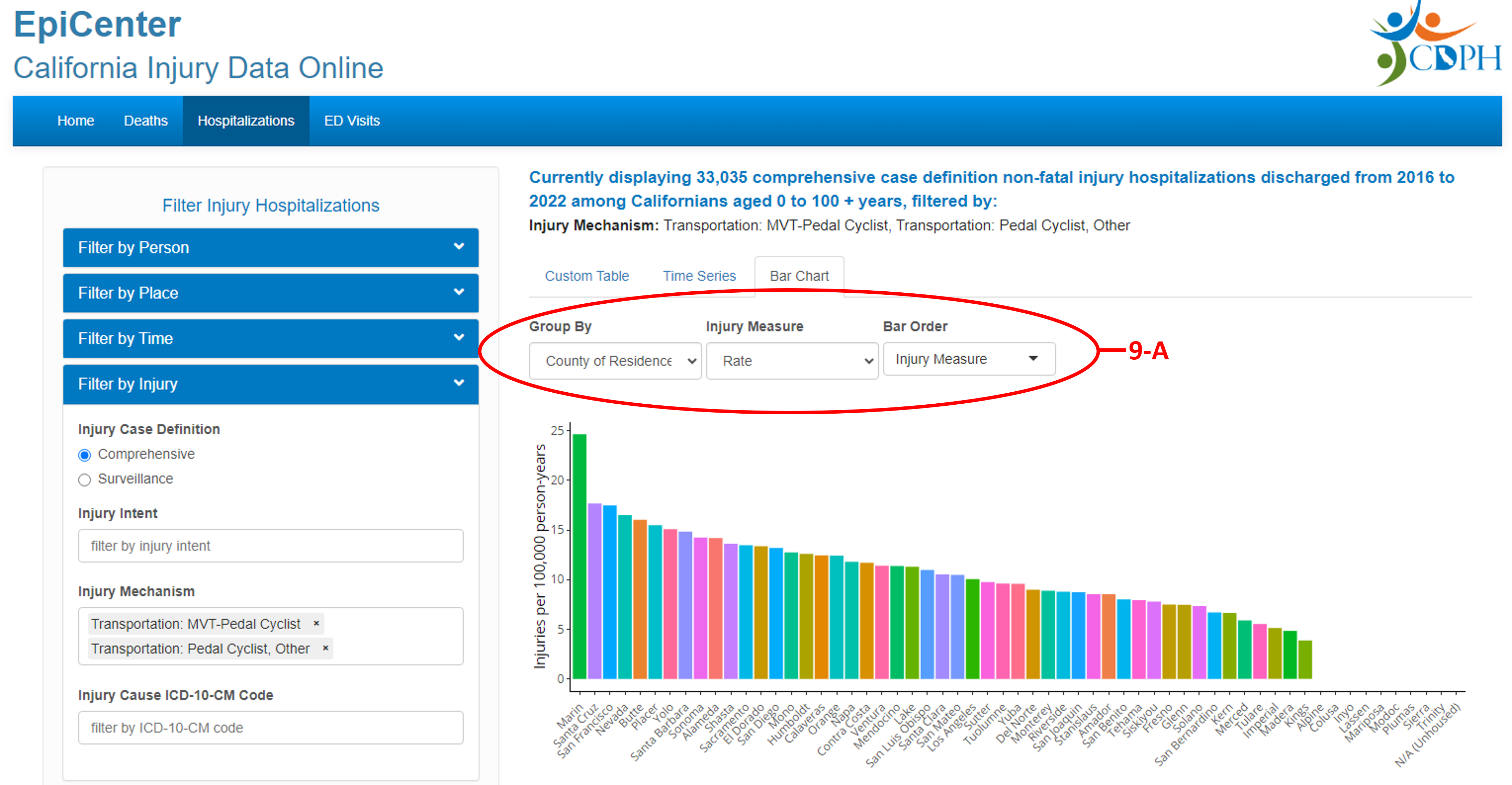
3. County comparison of injury rates
The Bar Chart display can provide insight on how injuries vary geographically across California. Comparing injury rates across counties can help determine if a specific county has a relatively high or low injury rate compared to other locations.
- Select the injury outcome of interest (for this example, MVT-pedal cyclist and pedal cyclist, other) and filter the data to the population of interest (but be sure to include all counties).
-
In the bar chart tab (9-A)
- Group by county of residence
- Choose rate as the injury measure
- Choose injury measure as the bar order
- The chart will now rank California counties from those with the highest to lowest injury rates.
EpiCenter was developed by the California Department of Public Health (CDPH) Injury and Violence Prevention Branch (IVPB) with funding from the Centers for Disease Control and Prevention (CDC).
For additional injury data help, please email us at EpiCenter@cdph.ca.gov .